
Design manual
Global styles & components
A live guide built with the theme’s actual idx- classes. Everything shown here is used on the website; use this page as a reference and for responsive checks (resize the window or open it on a phone).
01 — Colours
Palette
The two brand variables are the single source of truth; all yellow elements use --idx-yellow and its RGB value.
02 — Typography
Headings and body text
Font: Open Sans. The default heading weight is 500; bold sections use explicit <strong> (700). Body text is 14px with a 1.7 line height; paragraphs are 16px. The base font size is 14px, so hero headings set in em are calculated from this base (page-hero h1 = 4em = 56px).
Eyebrow label
H1 heading
H2 heading
H3 heading
H4 heading
XL display heading
This is a standard paragraph (<p>) in the body text colour, used for descriptions and section copy throughout the website. It includes bold i italic examples.
Type scale by breakpoint
Actual computed sizes (px) measured at three viewport widths. Columns: Desktop (>1350px) · Sm-desktop (861–1349px) · Mobil (≤767px). clamp(...) provides fluid scaling with the viewport.
| Element | Klasa / selektor | Desktop | Sm-desktop | Mobil |
|---|---|---|---|---|
| GLOBALNI TEKST | ||||
| Body (base) | body | 14 | 14 | 14 |
| Pasus | p | 16 | 13 | 16 |
| Eyebrow | .idx-eyebrow | 14 | 14 | 14 |
| H1 heading | h1 | 56 | ~43 · clamp(34,4.1vw,52) | 34 |
| H2 heading | h2 | 44 | ~34 · clamp(26,3.2vw,40) | 28 |
| H3 heading | h3 | 24 | 20 | 24 |
| H4 heading | h4 | 20 | 18 | 20 |
| Display XL | .idx-h2-xl | 64 · clamp(34,5vw,64) | ~41 | 35 |
| Display statement | .idx-display | 58 · clamp(30,4.5vw,58) | ~36 | 60 |
| HERO / SEKCIJE | ||||
| Hero naslov (Home) | .idx-hero h1 | 56 · clamp(42px, 5.3vw, 56px) | ~50 | 40 |
| Page-hero naslov | .idx-page-hero h1 | 4em (56px) | 4em (56px) | 40 |
| Strip (Sigurnost…) | .idx-strip--display | 7vw | 7vw | ~55 |
| Hero lead (pasus) | .idx-hero__lead | 16 | 13 | skriven |
| Blur-box pasus | .idx-blur-box p | 15 | 13 | 15 |
| KOMPONENTE | ||||
| Menu link | .idx-nav__list a | 16 · clamp(15,1.1vw,17) | 14 | pilule (overlay) |
| Dugme | .idx-btn | 16 | 14 | 16 |
| Detalj — naslov | .idx-detail-row h3 | 26 | 26 | 26 |
| „Specifications:” | p:nth-of-type(2) | 24 | 24 | 24 |
| Spec stavka | .idx-specs li | 16 | 16 | 16 |
| Katalog — art / naslov | .idx-catalog-card h6/h5 | 15 / 17 | 15 / 17 | 15 / 17 |
| Varijanta — broj | .idx-variant h4 | 18 | 18 | 18 |
| FAQ pitanje | .idx-faq summary | 20 | 14 | 16 |
| Availability badge | .idx-avail-badge | 18 | 14 | 13 |
| Breadcrumbs | .idx-breadcrumbs | 14 | 14 | 14 |
| Footer tekst | .idx-footer / .idx-footer p | 15 | 14 | 15 |
Section strip (display)
03 — Buttons
Buttons
All corner radii use var(--idx-radius) = 10px. Primary hover state: yellow changes to dark (rgba(0,0,0,.6)) with yellow text. Hover to see the states.
Text links (arrow + underline)
Text links with an arrow and a fine underline. On hover, the underline turns yellow and the arrow slides to the right.
Frosted CTA rule: Transparent buttons and availability badges use subtle transparency with backdrop-filter: blur(6px), plus the existing brand border and radius. This global effect applies to hero CTAs, outline buttons, the phone CTA and badge components.
04 — Blur box
Glassmorphism panel
Used over hero images. A translucent grey panel with backdrop-filter: blur(15px) and white text.
Heading in the blur box
A translucent panel with a blurred background for text over a product image.
05 — Image zoom (product variants)
Interactive product cards
Click an image to focus and expand it, with a 1.1× zoom inside the frame. Click outside the box to reset it. The yellow strip always stays the same height.

501.01
White
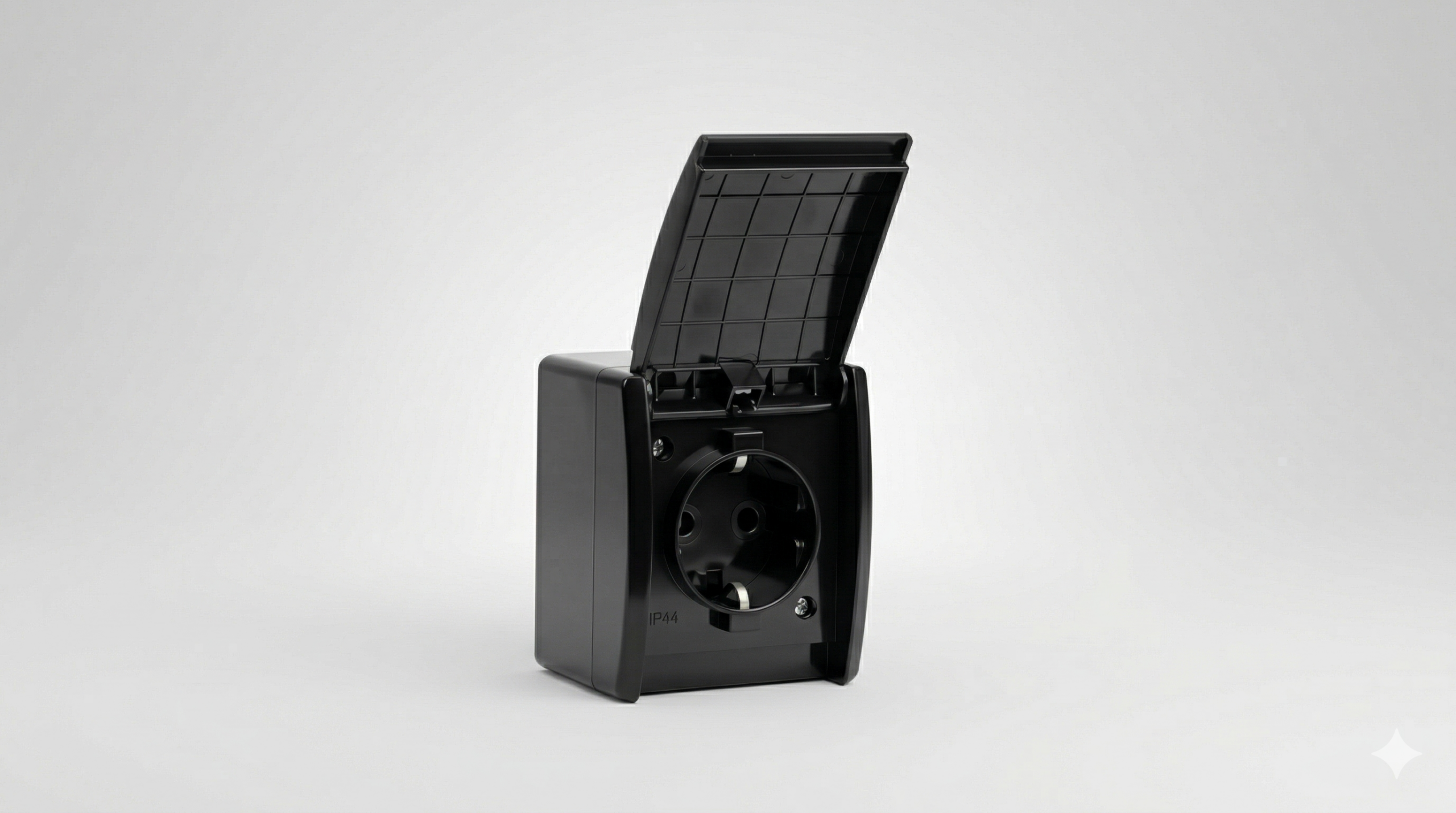
501.03
Black
06 — Form fields
Contact form
Dark fields on a black section, with a 16px radius (20px for the textarea) and a yellow focus border. Topic “radio” controls are circular with a yellow checked indicator.
07 — Tokens
Radijusi & kontejner
08 — Catalogue cards
Product grid
Shared frame with vertical dividers. On hover, the image zooms to 1.06, the “More details” underline darkens and the arrow slides. The grid has 3 columns (or 4 with the --4 variant).
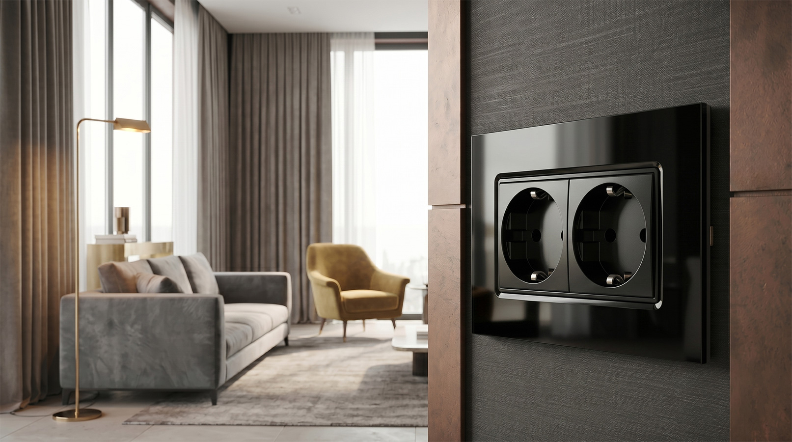
Art. 101.xx
Modularni program
A short two-line product description keeps the cards aligned.
Detaljnije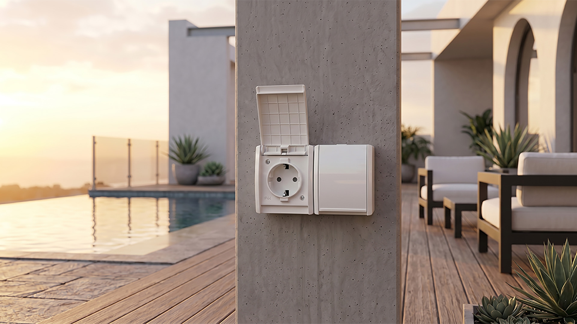
Art. 501.xx
OG MAX IP44
A surface-mounted range for demanding conditions.
Detaljnije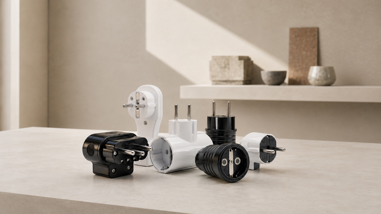
Art. 102.xx
Connection products
Reliable connections for your appliances.
Detaljnije09 — Product detail
Detail row + specifications
Two-column row: variants on the left, text on the right. The title is uppercase at 26px; the subtitle is grey italic at 18px; “Specifications” is 24px; the list uses yellow bullets and bold values after colons.
501.01
White
501.03
Black
Single-phase OG wall-mounted socket outlet
A robust, safe solution for fixed wall mounting.
Specifications:
- Rated current/voltage: 16 A / 250 V
- Earthing contact
- Standard: IEC 60884-1
- Available in 2 colours: white (501.01), black (501.03)
10 — Breadcrumbs & badge
Breadcrumb trail and badge
Breadcrumbs appear on the dark hero (only the first link is clickable). The availability badge is a solid yellow block.
11 — FAQ accordion
Questions and answers
Click to open with animation (theme main.js); opening one item closes the previous one. Icon: ↓ / ↑.
Is wholesale available?
Yes. Contact us for our wholesale terms and price list.
What is the delivery lead time?
Standard products are in stock. Lead times for specific variants can be agreed on request.
Is technical support available?
Yes. Technical documentation and installation support are available.
12 — Responsive behaviour
Breakpointi & ponašanje
The theme is designed with mobile behaviour in mind. Resize the window or open the page on a phone; the indicator in the lower-right corner shows the current width and active breakpoint. The components above are live, so responsive behaviour can be checked here.
| Breakpoint | What changes |
|---|---|
| ≤ 1450px (od 861) | Mega dropdown: kompaktan single-row, max-width 1000px, aspect 9/11 |
| ≤ 980px | Sekcijski razmaci i tipografija se smanjuju |
| ≤ 900px | Catalog grid → 1 column; detail-row → 1 column; variant-pair visina 300px |
| ≤ 860px | hamburger menu; fullscreen overlay; „Products” → yellow pills (button style) |
| ≤ 767px | Telefonska tipografija: h1 34 / h2 28; strip i display se smanjuju |
| ≤ 600px | Forma i footer → 1 column; topic lista → 1 column |
Reference widths for checking: 37576890012801440
13 — Product menu (mega menu)
Breakpointi, veličine & razmere
The “Products” dropdown changes its container, column count, card aspect ratio and corner radius according to screen width. The boxes below show the actual card proportions (w:h) at each breakpoint.
| Breakpoint | Kontejner | Raspored | Aspect-ratio | Radijus |
|---|---|---|---|---|
| > 1450px desktop | min(1200px, 92vw) | 4 kartice u redu · gap 6px | 9 / 12.8 (≈0.70) | 12px |
| 861–1450px compact | max 1000px, centriran | 4 u redu · gap 4px · manji font | 9 / 11 (≈0.82) | 12px |
| ≤ 860px overlay | 100% (list max 460px) | 1 column — yellow pills (button style) | auto (height based on content) | 10px --idx-radius |